Written by: Mitchell Parker, Houzz Editorial Staff
Home design trends seem to spring up from anywhere. Sure, geographic location sometimes dictates what’s popular. After all, what works for a home in Arkansas might not translate to a lakeside home in Washington. But often what’s happening on a local level can easily get adopted thousands of miles away. So to get a sense of what’s popular around the country right now, we asked five designers what their clients have been requesting lately. Here’s what they had to share. No matter where you are, it’s worth considering bringing these trends home.
1. Wood Features That Warm Up White Kitchens
As we’ve continued to report, white cabinets aren’t going anywhere anytime soon. In fact, 43% of renovating homeowners will choose white cabinets, according to the 2019 U.S. Houzz Kitchen Trends Study. But that doesn’t mean the entire kitchen will become white on white on white. Warmth is key to any balanced design scheme, and the quickest way to provide that is with good old-fashioned wood. Many designers are introducing wood in kitchens with white cabinets to lessen the stark feel and add texture.
“As a whole, people are looking to ‘warm up’ the white kitchen,” New Jersey designer Virginia Toledo of Toledo Geller says. “A white kitchen will always be tried and true but can lack personality. We are integrating wooden stained islands, butcher block and wooden backsplashes more and more.”
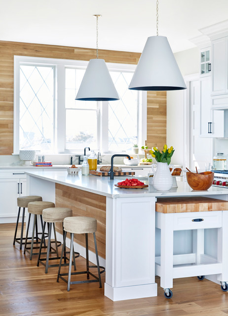
In this New York kitchen, Toledo incorporated a butcher-block chopping station on casters and white oak wood boards on the island and sink wall.
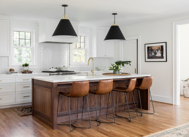
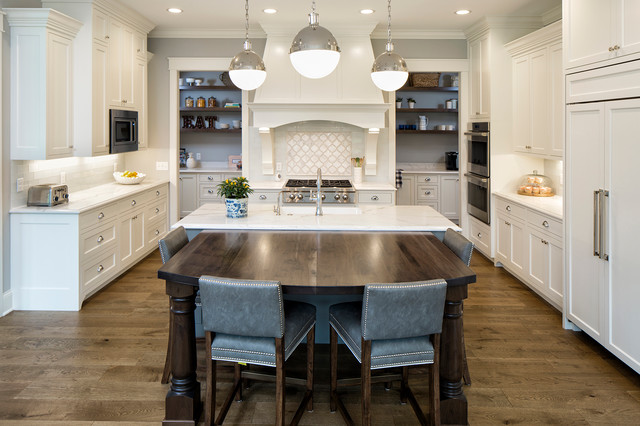
Here, designers at Casework in Portland, Oregon, used a large walnut island to complement oak floors and warm up marble countertops, white cabinets and a glossy white tile backsplash.
2. Picket Tiles
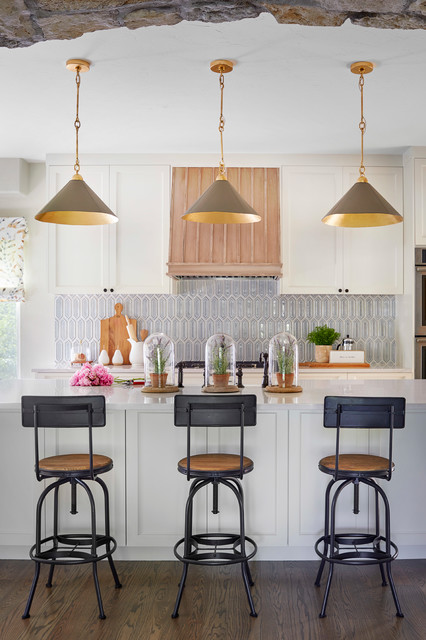
“I love picket tiles right now,” Virginia designer Sarah Kahn Turner says. Just what are they? Think of the top of a picket fence but mirrored on the opposing end. Or better yet, imagine an elongated hexagon. Either way, it’s a subtle geometric shape that makes a big statement.
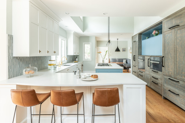
Turner used miniature picket tiles for the backsplash in the kitchen shown here.
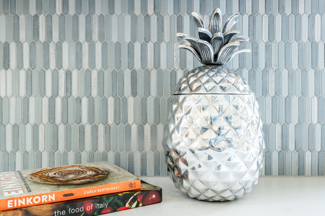
Here’s a closer look. When colors are varied, the shape takes on a mosaic pattern that’s calmer than with a smaller shape such as penny rounds.
Shiny picket tile adds glamour to this Denver kitchen by Duet Design Group.
Coyote Design Architecture + Planning PLLC
And in this Seattle kitchen by Coyote Design Architecture + Planning, horizontally laid picket tile with dark grout offers a more modern-day spin on classic white subway tile.
3. Blue, Black and Soft White Cabinets
While white cabinets still dominate, some designers are seeing more clients open to other options. Designer Jennifer Jacob of Builders’ General Supply is seeing a shift from requests for gray-painted cabinets to black and navy blue. “I believe the addition of navy to the current design elements of white and wood make a beautiful transition from the gray,” she says.
She points to this white, wood and navy kitchen by Imagine Design as a good example of what’s to come.
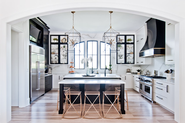
Jacob says that adding some black cabinets to white cabinets creates a classic yet dramatic design. “Add in a little brushed brass or gold-finished hardware and your simple white kitchen is now chic,” she says.
Meanwhile, when it comes to white cabinets, Jacob says she’s seeing a transition from “stark bright white to a softer white, like Alabaster (by Benjamin Moore), which pairs well with the black and navy trends.”
4. Classic Tile Laid in Modern Patterns
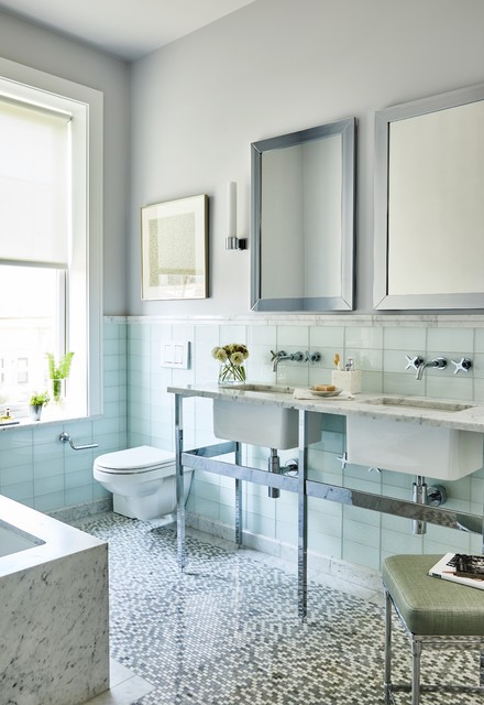
Designer Joan Enger of J. Patryce Design says her clients generally prefer more timeless, lighter palettes and materials. But she doesn’t let that keep the design from being interesting. Instead, she tries to mix things up with unexpected twists. One way she does that is by installing classic subway or rectangular tile in a vertical or stacked pattern to give it a fresh look.
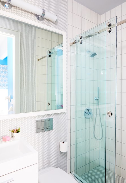
In another project, she achieved the same goal by stacking the tile vertically.
5. Rattan, Sisal and Other Natural Materials
Designer Emily Hancock of Rollins Andrew Interiors is seeing a return to natural materials being incorporated into a room. “It could be the addition of a rattan or wicker stool or chair, sisal, abaca or jute rug, a seagrass coffee table or side table or bamboo table or floor lamp,” she says. “This is always a favorite of mine to use on a project.”
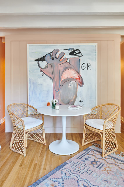
Here, a pair of rattan chairs complement a midcentury Tulip-style table.
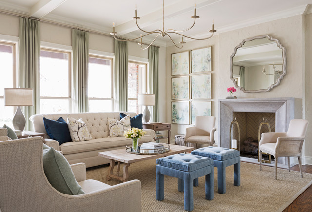
In this Little Rock, Arkansas, living room by Katie Grace Designs, a seagrass rug adds a casual vibe to traditional details.
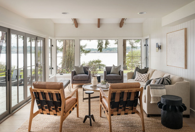
And in this Seattle living room by Dana Webber Architect, a jute rug nods to the natural surroundings.




 Pinterest
 Linkedin
.png) Instagram
Instagram.png) Facebook
Facebook Mortarr