Every year Sherwin-Williams shares their Colormix Forecast and this year it was all about the rhythm of the natural world and how we can use that as inspiration to balance our own world and put us in the right mindset and mood throughout 2021.
Color trends are a little more muted, natural, and inspiring than last year. With the hectic year of 2020, everyone is hoping for a calmer, dependable and motivating color pallet. Now more than ever we are using color to help us be the people we want to be. Whether we want to feel calm and relaxed or motivated and inspired we hope the color of our spaces reflect that.
“Rhythm is the secret to how the natural world stays in step. The same sense of balance applies to our personal sense of nature through how we live — and how we design. Fast and slow. Quiet and expressive. Virtual and physical. See it take shape in 40 trend colors, presented in four palettes designed to bring your own rendition of rhythm to beautiful life.” – Sherwin-Williams
Sanctuary: Back to nature
“The principle of biophilia — bringing nature inside — permeates the Sanctuary palette with its remarkable ability to nurture wellness and calm.”
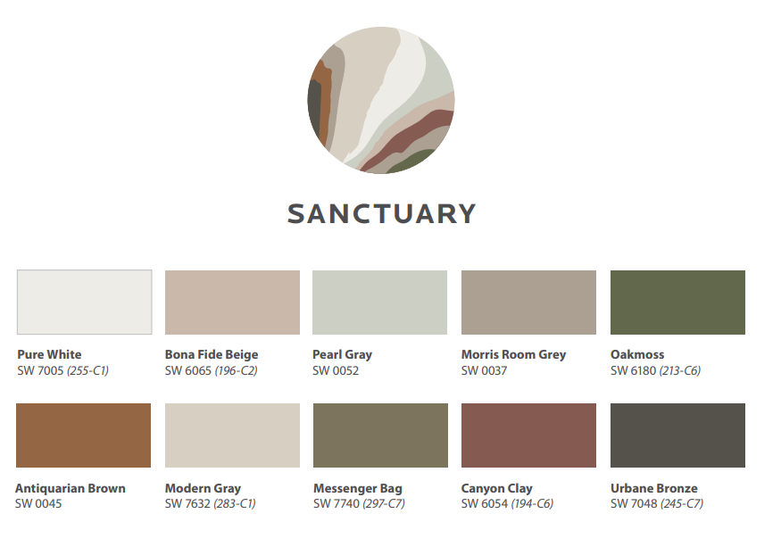
The Sanctuary palette is full of muted hues that are earthy and natural. As the name implies, these Scandinavian inspired hues evoke a cozy calmness that almost forces us to pause and reflect, perfect for creating that haven in your home.
Encounter: Layer of Local Character
“Heirlooms and the stories behind them give design special meaning and define the rich texture of the Encounter palette.”
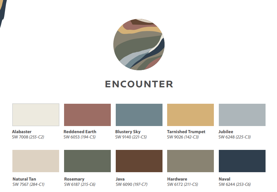
Influenced by:
Hyperlocal
Modern Bohemian
Natural Materials
Storytelling
Inspired by the past, the Encounter palette speaks to us now and will guide us into the future. With earthy tones, and function reimagined this palette will provide security and safety.
Continuum: an ethereal spectrum
“Smart living is at the touch of our fingertips and the sound of our voice — and it’s reflected in the Continuum palette’s hybrid of synthetic and natural.”
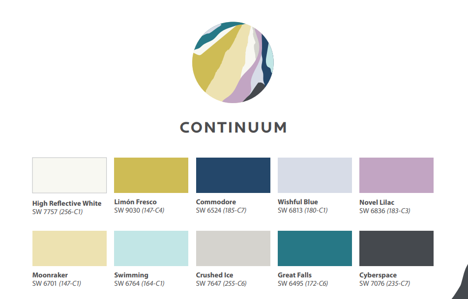
Continuum is perfect for mixing natural and synthetic. In this day and age we depend on technology and there’s no getting rid of those functional items so form follows function and this palette makes it easier for those functional items to blend in.
Tapestry: Permission to Play
Creative expression — a top influence for the Tapestry palette — is all about personality and authenticity.
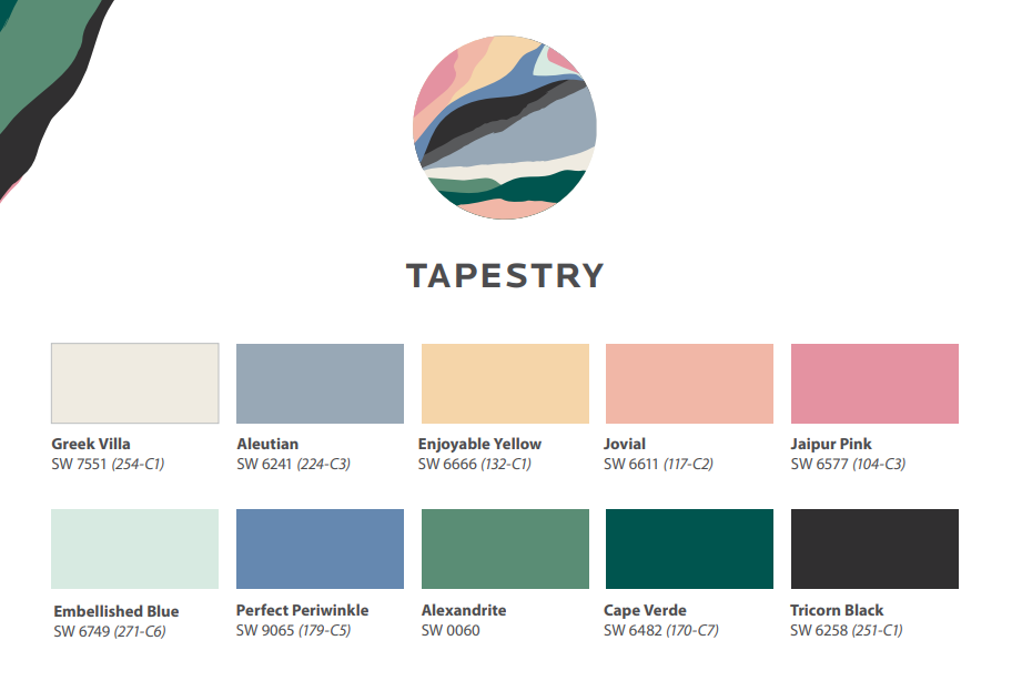
Although we want to use 2021 to calm us and allow us to reset, we still want something to make us feel creative and joyful and that’s just what the tapestry palette is for. When paired with patterns and texture, this palette bursts with a story.
These 40 colors truly speak volumes and are so versatile for any style or room. We look forward to seeing how everyone mixes these colors to inspire the greatest year yet.
If you missed it, check out our last blog post on “Sherwin-Williams Color of the Year and go to Sherwin-Williams’ website to see the Colormix Brochure and more.
https://www.swcolorforecast.com/wp-content/uploads/2020/07/SW.Colormix.2021.pdf


 Pinterest
 Linkedin
.png) Instagram
Instagram.png) Facebook
Facebook Mortarr